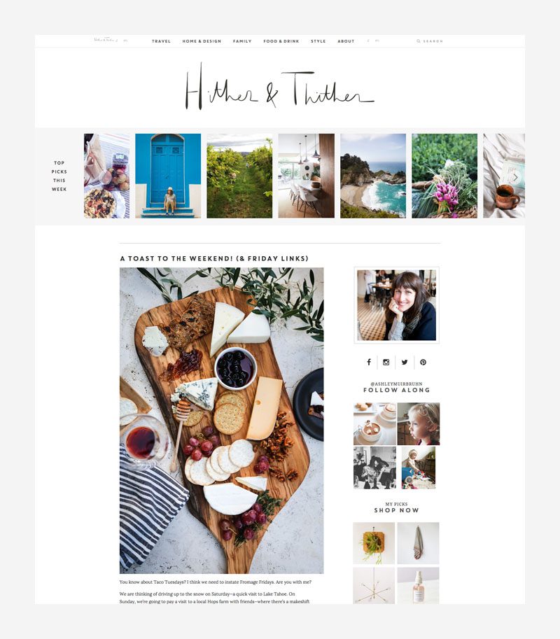
I am so excited to finally get to share a new design for the site!
I can’t believe how long this has been in the works. I feel like I’ve been wanting to talk about it for ages! I think it was sometime last spring that I first got to making plans. It really all started because I wanted to be sure the site was as easy to read on your phone as at your desk—and I wanted it to load fast. But as with any kind renovation, that turned out to be just the beginning. It was a long wishlist of small changes that eventually turned into a complete redesign.
Here are some of my favorite changes you’ll see. I imagine we’ll encounter a few kinks, particularly in this first week. Please go explore and let me know what you think…
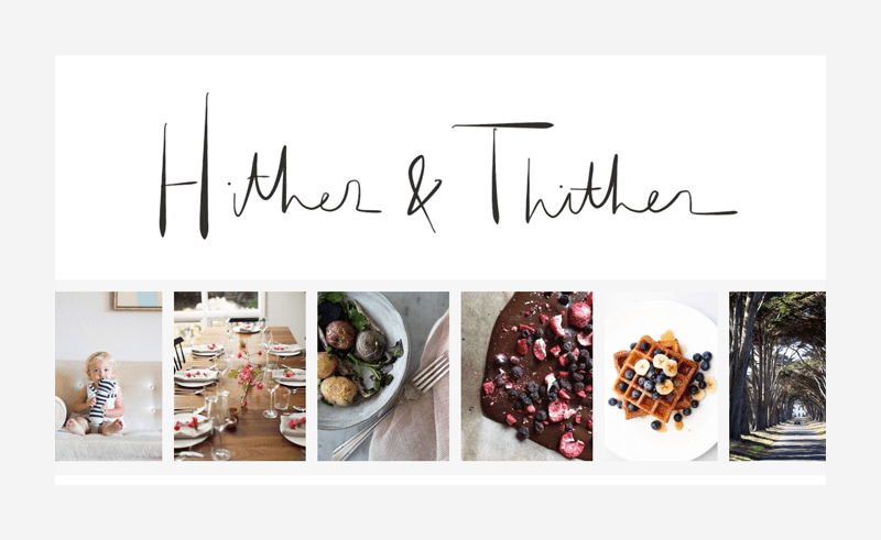
I went in thinking the current design was working well, and not expecting big changes. For the logo, maybe something very type-driven, very different from what was there before? But those didn’t have enough of a personal touch so, in the end, I went with my own handwriting. I have a lot of friends to credit for giving me feedback on the different revisions along the way.
I worked with Allie of The Wonder Jam again, and some of the adjectives I passed along (beside a Pinboard of inspiration) included clean, fresh, modern, approachable, intuitive, and grown-up.
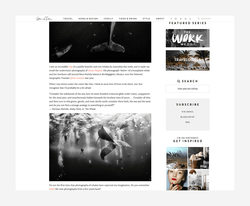
Brandi Bernoskie worked with me on the backend and ease of use was definitely the priority. I’m really happy with the new navigation bar you’ll find at top where the categories have been reduced from eight to five, and the search option for old posts is more clear. You’ll also find a link to the (revised) About page up there.
I love that we made the navigation bar “sticky,” so that it stays with you as you scroll down the page.
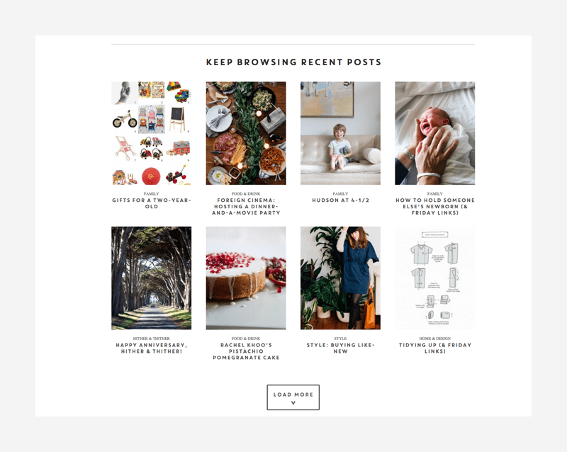
I decided to stick to the traditional blog content column; only now, after three posts, you can see everything that came before without reloading or clicking through a numbered list of pages! Instead a “Load More” button will just keep expanding the page throughout the archive. And, below the logo on the homepage is a new sliding scroll with top picks.
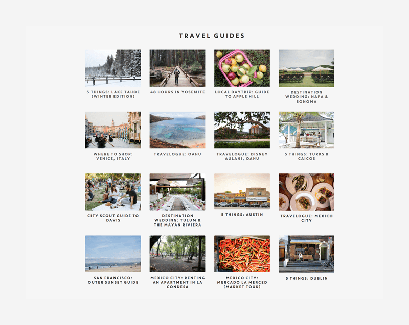
Travel remains a favorite topic, so special attention was given to any posts that might serve as a guide in the new Travel Guides section.
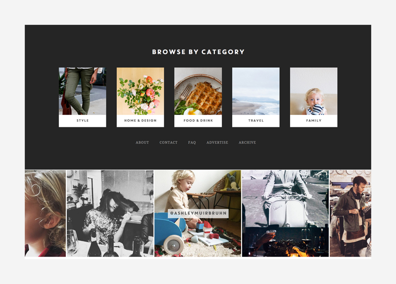
The sidebar stayed fairly true to the previous site’s, with the exception that I’ve added a regularly updated Shop option—a place to share favorite finds and products that might have only previously made it into seasonal gift guides. I’ve given my Instagram feed a place there—as well as in the new footer. It’s funny to think how much more I use Instagram since the last revision! I wanted all of those moments to have a home on the blog.
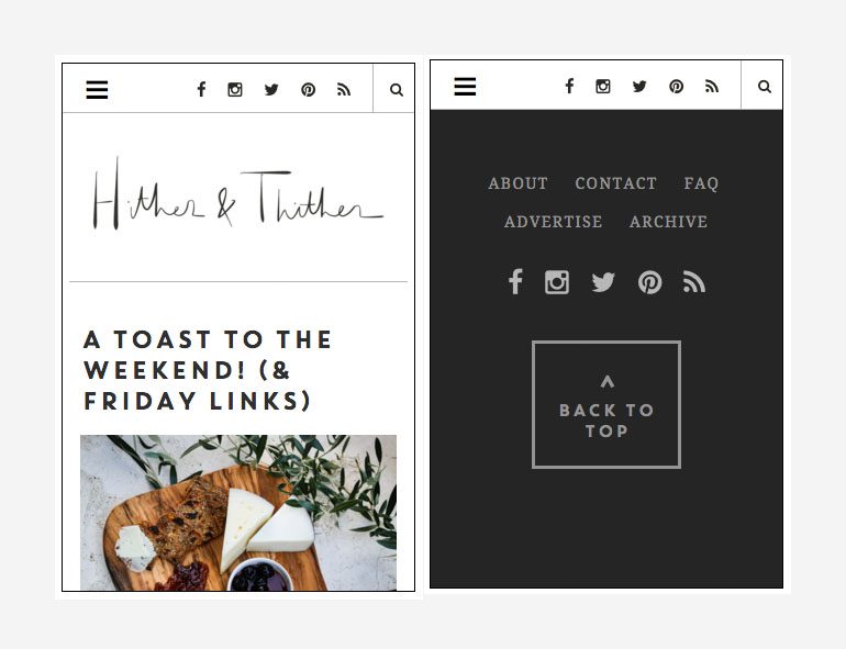
Finally, you’ll notice that some things are organized a bit differently on mobile. It was a big priority to make the experience there as easy to navigate for readers who prefer to check in on their phones. There’s new dropdown menu and search function, the choice to jump back to the top once you’ve scrolled to the bottom, and more options for browsing than there were previously. And you should never have to pinch and zoom to get around.
I really hope you like it! I look forward to any feedback! Cheers!
P.S. A huge thank you to Alexis, who has been working hard on this with me for many months.
















32 Comments