
by Anna Smith of Annabode + Co.
One problem my clients are always struggling with is how to infuse uniqueness and personality into a newly built home. (Especially in Denver, where cookie-cutter developments are popping up by the minute!) I recently tackled a space that didn’t have very much “visual interest” on its own. My client Gina, a young mom of two, had moved into a new build somewhat recently. She had been slowly replacing the basic, builder-grade fixtures with ones more to her (excellent) taste, but was stumped when it came to the master bedroom. Her style definitely leans bohemian/eclectic, and the bedroom wasn’t reflecting that…
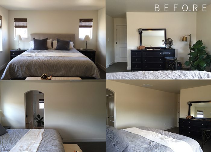
Her main concerns were replacing the dark, matching bedroom set and making the room feel bright and airy. As Gina put it:
We’ve had the same matching set of furniture for a decade. I hate it, but it was low on the totem pole until now. I’d like to see a bohemian minimalist/modern space with unfussy linens and calm neutrals that just make me want to relax. I thrive on order and actually find that a more bohemian/mis-matched look calms me…probably because things aren’t perfect and aren’t supposed to be.
I envision a new ceiling light along with two plug-in bedside sconces for reading. New bedding (or just new duvet) and some accent pillows. I’d love a rug, new nightstands (not necessarily matching if you think it’s better that way…I’m open to it), new dresser, chair/lamp/side table seating area, full length mirror and any wall decor/small decor items necessary. If we couldn’t fit a seating area, maybe a cool leather woven bench or stools at the foot of the bed. Really looking to have a completed room at the end of this…all the bits & pieces.
We needed to keep the bed frame and headboard, which was a nice neutral backdrop and relatively new. The dark woven shades also needed to stay, as well as the wall color, fan, and fiddle leaf fig—but the rest was fair game. Before the design process begins, I always ask my clients to create or send me their Pinterest boards so I can have a clearer visual of what they’re looking for. I look for patterns and commonalities, and then narrow in on their most-loved designs:
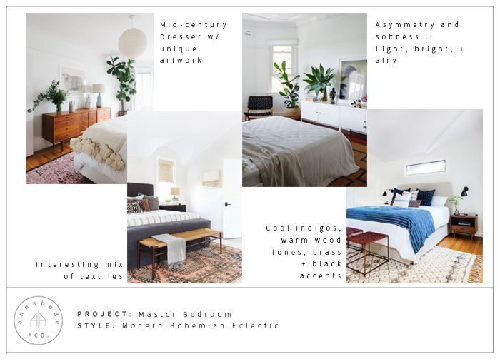
Gina was so helpful in that she knew her own mind and had a pretty clear vision for how she wanted the room to feel: bright, modern, eclectic, and a little boho. Her budget was enough that we could make all those things happen, but we weren’t about to gold leaf the walls either! The most important elements for me were color and texture—lots of basketweave, leather, wood, and brass…basically all my favorite things!
The first design looked a little something like this:
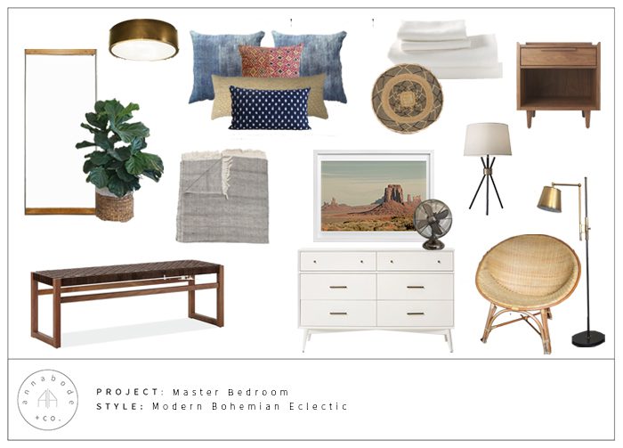
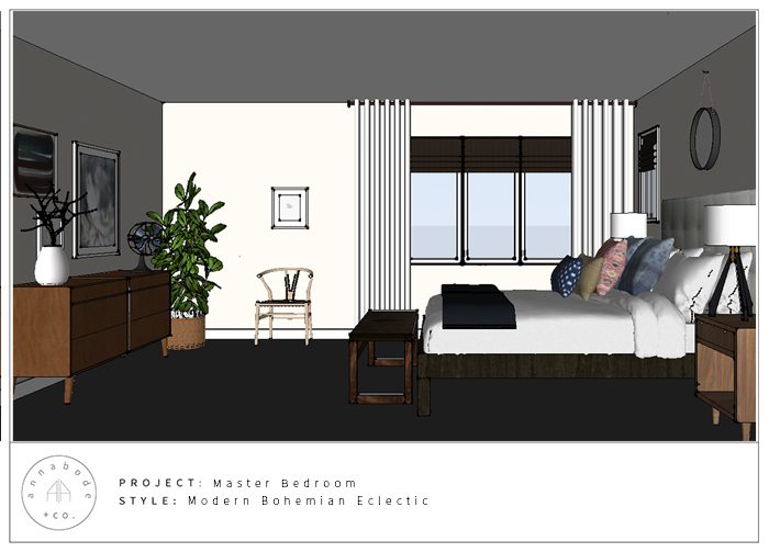
Gina wanted bedding that was neutral and “unfussy,” so we opted for white linen—which is super soft and has this lovely subtle wrinkled effect (it’s never crisp like percale). Brightly hued pillows in vintage textiles were a must-have and pop perfectly against the white duvet.
A woven leather bench at the foot of the bed softens the transition between it and the floor, as well as provides a convenient place to put on socks and shoes. Mid-century style nightstands in a lighter wood brighten up the head of the bed, while tripod lamps with brass accents fill the negative space above the nightstands better than her existing ones (plus, non-cone shades would bring the style more up-to-date).
Although Gina was hoping for sconces, the placement of her windows on either side of the headboard really didn’t allow for it. Instead, I sourced table lamps that echoed the spirit of the sconces she had shown me.
After the first round I made some changes based on Gina’s feedback and my own recommendations—we nixed the seating area in the corner for a larger vintage dresser and accent chair near the window, added a gallery wall for more asymmetry, swapped out the overhead lighting for something more unique and added a mirror over the bed instead of the Binga basket for more contrast:
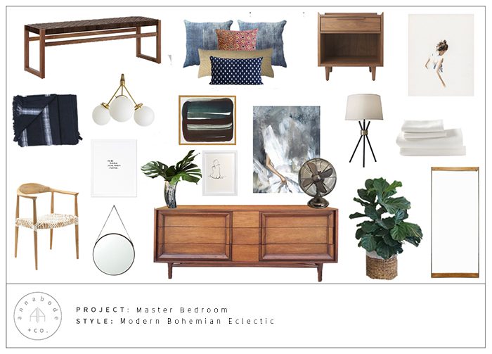
The space is almost finished and I can’t wait to share it once it’s photographed! Post-design, we decided to add some sheer white curtains to soften the large window, and swapped out the boxspring for a shorter 4″ one to bring the bed height down to more mid-century proportions. It’s looking so good you guys! Definitely a far cry from the basic, beige box that it started out as. Here’s the design that Gina approved, based on my 3D model of her space:
And here’s how you can get the look!

Thank you, Anna!
Anna Smith wants to live in a world where good design is accessible and affordable for everyone. An interior designer based in Denver, Colorado, she creates modern homes for clients across the country through her firm Annabode + Co. When not buried in swatches and throw pillows, you can find her elbow-deep in renovations at her own fixer-upper. Find out more about working with Anna at Annabode.com.

























8 Comments