By Anna Smith of Annabode + Co.
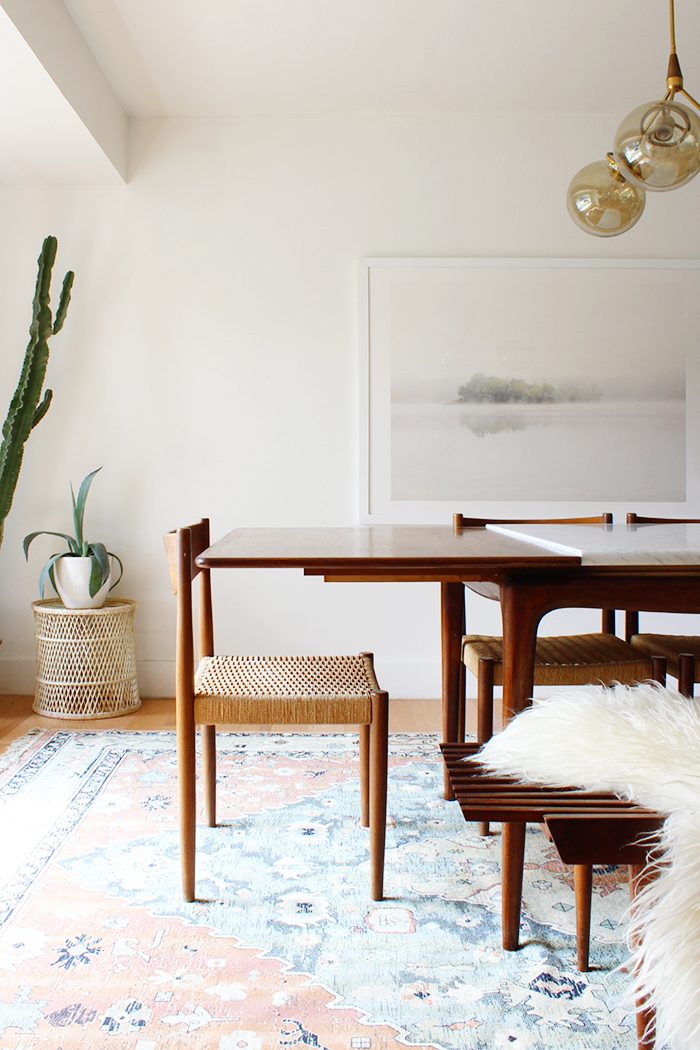
When my husband and I moved to Denver from DC, I remember eagerly looking forward to the day when we could finally have an actual dining room. The teeny tiny house we were leaving behind had what we affectionally called a dining “corner” opposite the kitchen, a space about four feet wide where we could just squeeze in a little table and some chairs. So when we were ready to convert the living room in our Denver fixer-upper into a separate dining space, I couldn’t have been more impatient!
Today it’s about 90% finished—we have yet to install a new front door and window trim—but it’s my favorite room in the house. When Ashley asked me to share it, I thought it would be a good excuse to chat about dining rooms in general and specific do’s and don’ts when it comes to decorating them (most of these tips still apply whether you have a separate dining space, open floor plan, or a smaller-scale apartment). So without further ado, here are my Five Steps to Designing the Perfect Dining Room:
1. Choose items that are to scale.
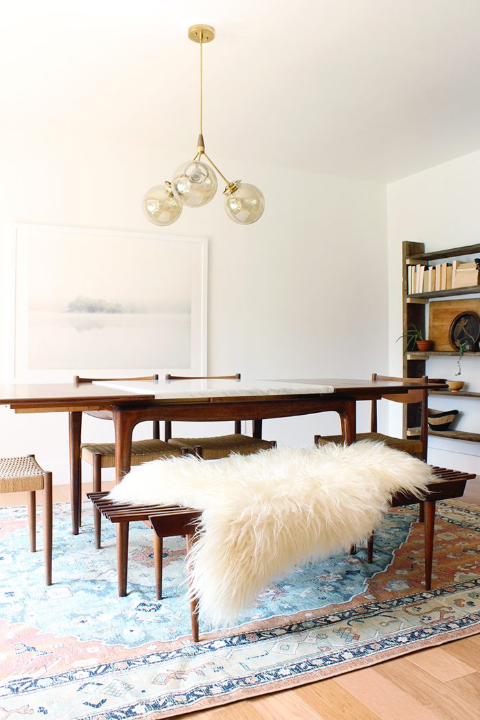
This sounds like a no-brainer, but it can be hard to remember when you stumble on a piece you really love (especially if it’s vintage) or if you’re trying to stretch the function of a smaller room. The larger the room, the longer the table you should have–and vice versa. For extra-small or corner spaces where you don’t do a lot of entertaining, consider a round table which is easier to navigate around and takes up less space than one with corners. And please, no more bar height tables! They’re simply not comfortable for you or your guests—and unless your home moonlights as a restaurant, they’ll end up looking out of place.
Pay attention to scale when it comes to your chairs, too. Most table heights are about 28-30″; you’ll want your chairs to be at least a few inches taller, with seat heights at about 18″. If you chairs are shorter than or meet the table height they end up looking tiny, and if the seats are higher your legs will be uncomfortably squashed at dinner (too low and you’ll have your chin in your food). Mid-century furniture tends to be lower to the ground and smaller-scale, so if that’s your jam then just be mindful. And if you have a larger space, high ceilings, or an open floor plan, tall-backed chairs can be great for separating the dining area but can cramp a smaller room.
Your overhead lighting should likewise be sized to the room, but more importantly to the table. What I see most often in my clients’ homes are large tables with tiny, single-bulb light fixtures above that are hung too high. In general, the bottom of your light fixture should be more or less about 30″ from the table surface (this number can go up with higher ceilings, but I personally like to keep fixtures lower). A longer table (8+ seats) works best with a longer/wider light fixture, or even a series of pendants (try 2-3), while single-bulb fixtures that are 18″ or less wide should reserved for tables that seat four.
When it comes to rugs, I recommend choosing either the largest rug for the space or for the table (including the chairs). The legs of your table and chairs should sit on the rug when pushed in, but ideally when guests push back their chairs to get up, all four legs should still be on the rug (bonus–this will protect your floors from scuffs!).
2. Create enough light.
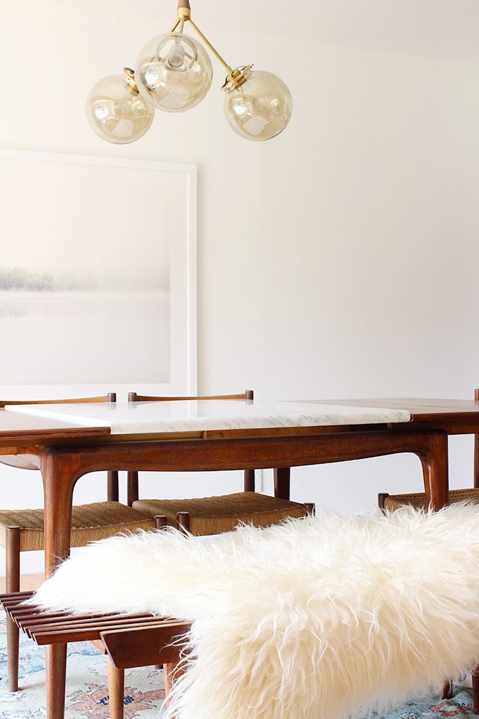
Make sure you have enough bulbs in your pendant or chandelier to adequately light the room in the evening, and compensate if needed by adding a lamp or two on a sideboard. Lighting operates on the same principle as scaling your furniture: the larger the room, the more bulbs in your chandelier are needed. Be aware too that an opaque glass shade gives off more diffused, even light from a single bulb than a clear one (the same goes for bulb itself). For example: in our own space, we probably could have gotten away with fewer bulbs if we had opted for opaque shades.
3. Add contrast.
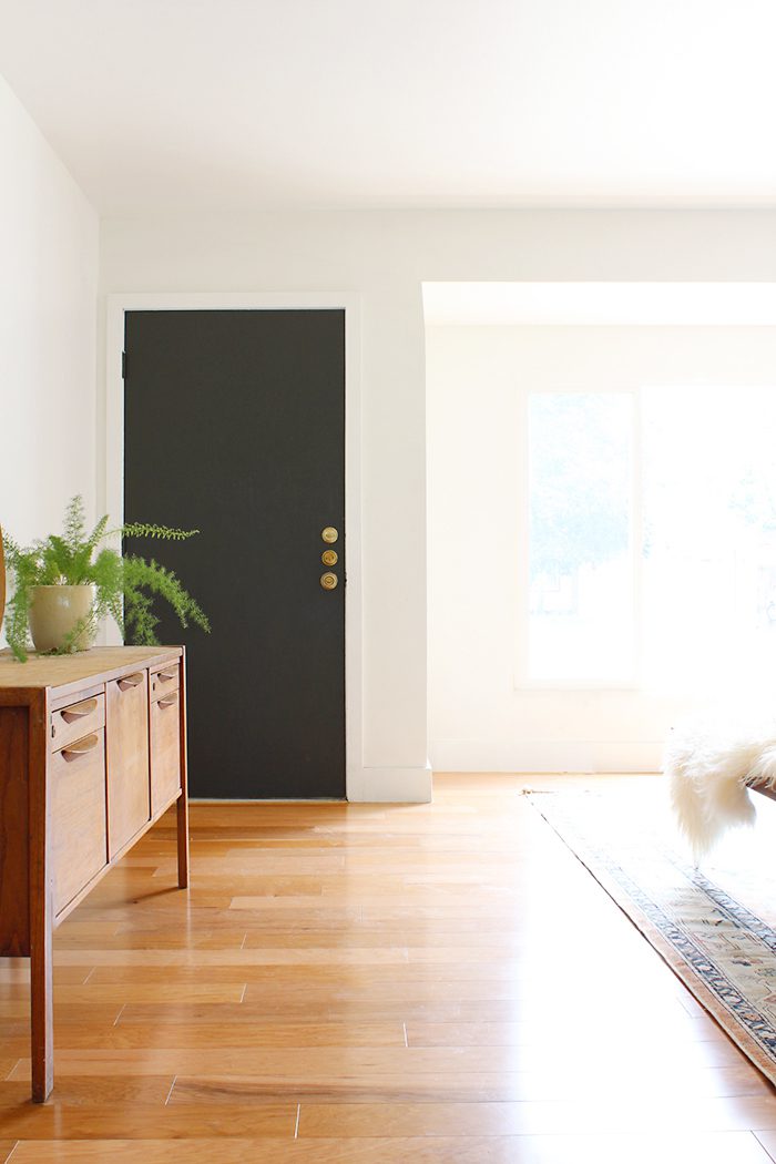
Visual contrast is what makes all rooms feel alive, beautiful, interesting, and unique, and the dining room is no exception.
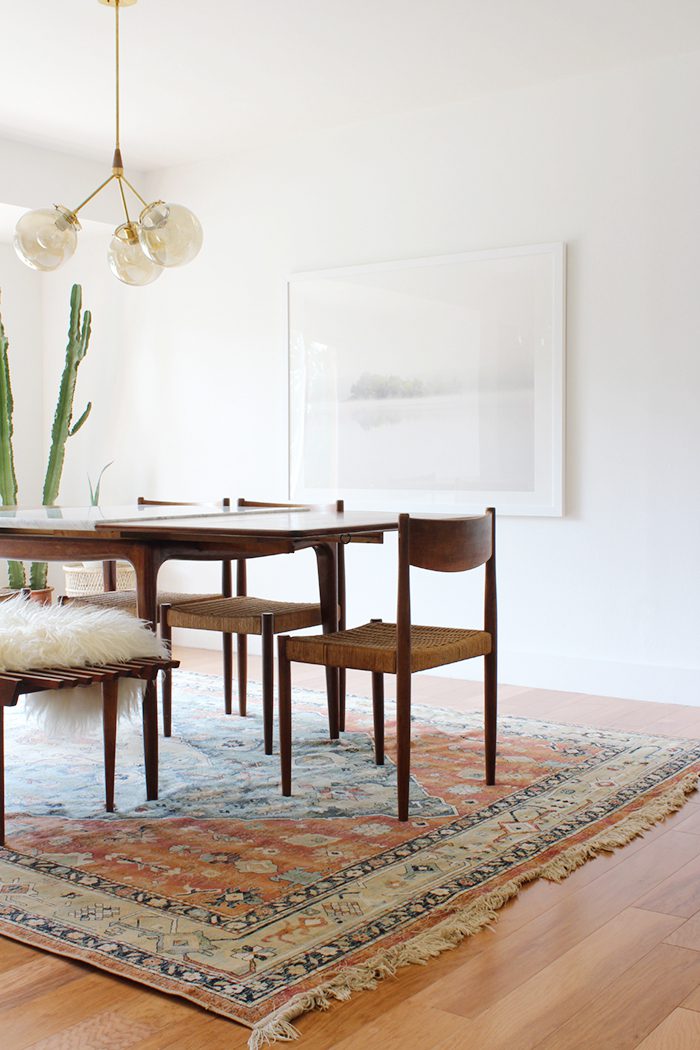
I like to make sure there is a contrast between tables and chairs, either of material, style, or both. This can be wholly (like a rustic wooden table with linen slipcovered chairs) or partially (in our space the woods in our table and chairs are similar, but the chair seats are woven). Try mixing mid-century chairs with an industrial table, or a traditional table with more modern chairs, for example. Also, don’t feel like all your chairs need to match! If your style is more eclectic, consider arranging various bentwood or Windsor chairs around a simpler table. Or opt for different chairs at the table ends, or swap out a few chairs for a bench instead.
Another excellent way of adding contrast is with a rug. I truly believe all dining spaces can benefit from one—they instantly make the room feel more comfortable and inviting! There’s something about a bunch of hard surfaces all together that makes me an uneasy, and I can never get excited about a wood floor, wood table, and wood chairs without something underneath. There are so many options for those of us with kiddos or wary of stains, too (just keep reading!).
4. Design with function in mind.
The most important consideration when designing your dining room is how exactly you’ll be using it. Do you eat every meal there, every day—or is it holidays-0nly? Are you hosting dinner parties every other weekend, or does the table double as a craft room for the kids? Knowing the answers to these questions is paramount when it comes to choosing materials and even which pieces of furniture are necessary for your space.
If you entertain very little and eat mostly in the kitchen, you obviously have a little more freedom when it comes to the design. Otherwise…
There are tons of options for heavy-use, stain resistant rugs now. I prefer synthetic rugs for under the table; ours is polypropylene, but it’s so soft you’d never know! Our son can also upend an entire bowl of spaghetti, and we can literally take it outside and hose it down if we want to. (Tip: look for “indoor/outdoor” rugs when searching online or check “synthetic” under materials). I also stumbled across Lorena Canals Rugs the other day, which makes…wait for it…machine-washable rugs that sound perfect for smaller dining rooms. And if you want something a little more natural, sisal rugs are a long-lasting and hardwearing alternative. Darker colors and intricate patterns also go a long way when hiding stains, and for the really desperate you can always slip a plastic mat under high chairs for extra protection.
When it comes to chairs, if you have messy ones with sticky fingers then either forgo upholstery or save it for the table ends. A bench can be a practical alternative for kids as well, as they have an easier time sliding along their lengths and they’re less likely to lean back in or tip them. Benches can be quite difficult to get in and out of for us grown-ups though, so if you entertain a lot then chairs are your best bet. Make sure you give your guests enough elbow room too, and save armchairs for the ends of the table if using them at all.
If your table usually takes a beating, choose harder-wearing surfaces or more rustic/weathered woods that can hide imperfections. Note that with harder surfaces (like glass, stone, etc.), your risk of dish and glass breakage increases though. For vintage wood tables that aren’t too precious, try coating them in several layers of polyurethane which will prevent water rings. (Please don’t do this if you have a lovely table in a precious wood!).

5. Choose storage wisely.
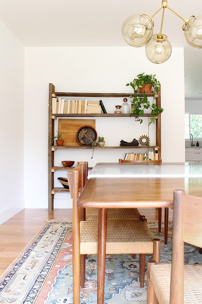
Basically if you have pretty items, display them if you can and save the rest for a sideboard or cabinet. Functional, attractive items like trivets, glassware, serving pieces—even salt and pepper shakers and napkins—can double as decor when styled in vignettes on shelves or other surfaces.
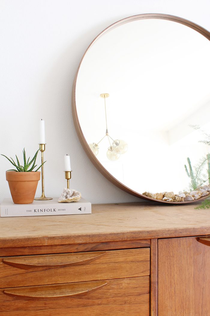
We personally use our sideboard to hide our son’s arts and crafts supplies, car keys, mail, etc. as well as larger flat items like placemats that are hard to display. If you don’t have many pieces you want the world to see, then maybe forgo bookshelves or glass-fronted cabinets in favor or those with solid doors, and your secret will be safe with me!
As always, there are no hard-and-fast rules when it comes to design, so take everything I’ve just said with a grain of salt. Think of these tips as guidelines, and keep them in mind next time you’re tackling a dining space!
Thank you, Anna! Your home is gorgeous!
Anna Smith wants to live in a world where good design is accessible and affordable for everyone. An interior stylist based in Denver, Colorado, she creates modern homes for clients across the country through her firm Annabode + Co. When not buried in swatches and throw pillows, you can find her elbow-deep in renovations at her own fixer-upper. Work with Anna.
P.S. Anna’s (jaw-dropping) kitchen makeover. And our dining room.




12 Comments