

This post brought to you by Progressive. See how much Progressive could save you when you bundle your policies.
There was very little that required changing when we moved in three years ago, but that doesn’t mean we haven’t slowly trying to make the space feel practical and personal, to make our house feel like home. Some things felt more urgent, like painting the walls or buying new rugs; other details have taken a back-seat. For a while now I’ve been wanting to make changes to our bathroom. It’s one of those spaces few people ever see, but stepping out into a calm, bright bathroom can really set the tone for the day, so it’s been nagging at me.
Finally, after spending so much time poreing over Anna‘s kitchen remodel and DIY tips on here, I reached out to her to see if she could take a look at the inspiration I’d been pinning and help me make some of it happen! I shared photos, measurements, and inspirational images over the web, and we talked over the phone or on email.
Here’s Anna’s side of the story…
“I’ve long admired Ashley’s sense of style, and when she asked me to help give her master bathroom a quick refresh, I couldn’t resist! The space is small, but has a skylight as well as a window (the holy grail of bathroom lighting!), so it gets great natural light. Most of the permanent fixtures had to stay, and there was definitely a lack of storage space to contend with.”

“Ashley wanted a space that was bright, calm, refreshing, and spa-like. I already had a good sense of her taste from her blog, but had her answer a questionnaire to make sure I had all the details. Her main concerns were: ‘The lack of storage space; the glass sink showed water spots and was too contemporary; the light fixture was ho-hum; the walls were slightly mint.’ Yes, mint!”
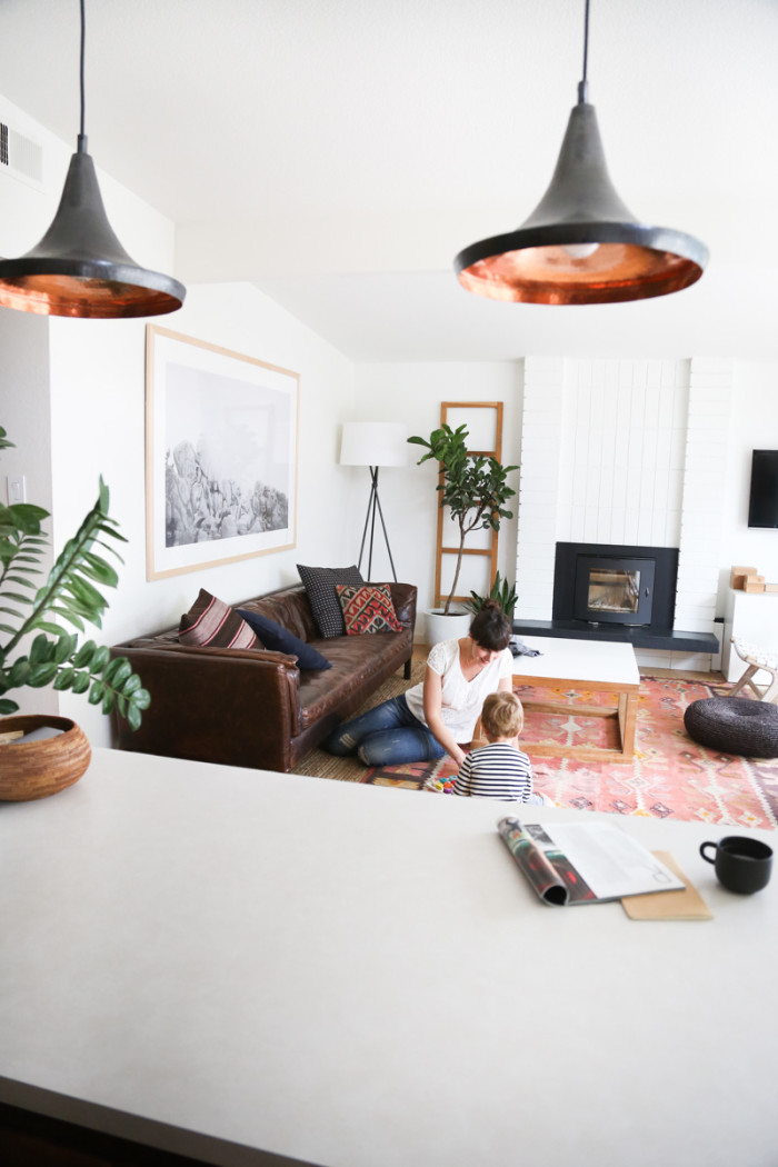
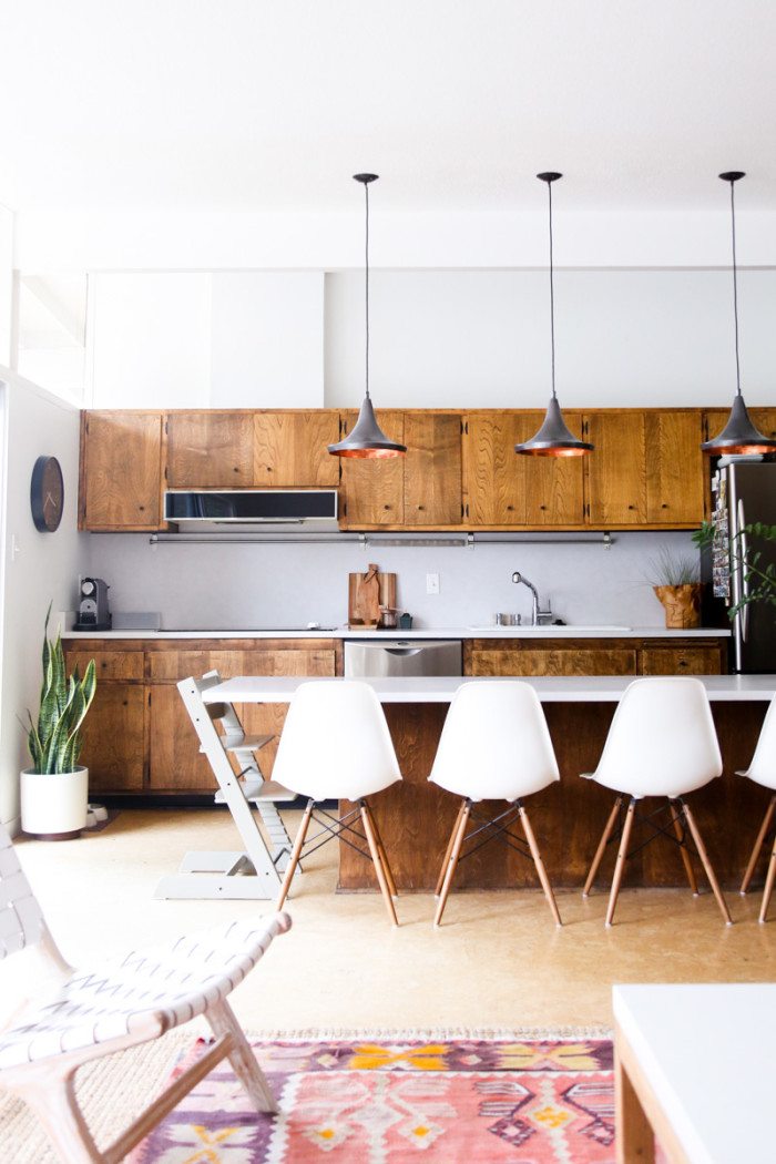
Anna and I both agreed we wanted the room to feel cohesive with the rest of my house—which has a lot of whites and warm wood tones.


Again, Anna: “With a short timeline and a tight budget, I got to work creating two mood boards that represented the California-Modern style that Ashley and her husband love, with a touch of boho and some natural elements that complemented the stone shower tile.”
“Mood Board 1 is bright and calm, thanks to the lighter wood tones of the IKEA vanity and the neutral kilim that picked up the tones of the shower tiles. I felt that the kilim was a nice little echo of Ashley’s living room rug, and using a paler wood would definitely give off that spa vibe she was looking for. We had chatted a lot about metal finishes and what would work for this project (since we couldn’t swap out everything), so the black/steel accents here add enough contrast without being matchy-matchy.”

“Mood Board 2 is still a tad more colorful and brought in the warm, red/orange wood tones from Ashley’s kitchen and living room with some mahogany drawer fronts from Semihandmade. All-in-all still pretty neutral, but not as subtle as Mood Board 1.”

“I wanted to give Ashley as many options as possible since things were moving so quickly, so I sourced multiple options for several items like the light, towel hooks, and rug.”


I found myself really drawn to the lighter wood of the vanity in mood board 1, paired with the more minimal black light in mood board 2. I also preferred the simplicity of the towel ring and toilet paper hook by Ferm, the white shelf, and the black hooks in mood board 2. At first I asked Anna about sourcing some wood hooks or knobs, but she pointed out that the wood can get ruined by wet towels over time.
And initially, I was not so into the idea of redoing the floor tiles—ours are pretty simple and are in good shape—but Anna pointed out that when we paint the walls white and bring in a white sink, the tiles may end up looking too buttery. So true!

“I combined the two and added more accessories in keeping with her aesthetic. For the shelf above the toilet, I added handmade ceramic containers from Hanselmann Pottery that she can put things like makeup brushes, Q-tips, and cotton balls in (the vanity will provide storage for the big items like a hair dryer and straightener). Two stackable wooden trays from CB2 add accessible makeup storage and bring in more of the wood tones Ashley loves; plants will make the space instantly feel more inviting and organic.
“Next I got started on building the model of her bathroom with the new fixtures and decor to make sure everything worked perfectly together. This is always the fun part, where we get to see how the space will actually look with all the elements we’ve chosen!”
[Sources: Southwest Cactus print / Hanselmann Pottery / Snowe Bath towels / Coyuchi towels in Seafoam / Wall-mounted light / Aesop Products / Wood trays / Wall Hooks / Ikea Sink and Vanity / Kohler Faucet / Towel ring / White wall shelf / Cement tiles / Planter / Kilim Rug]
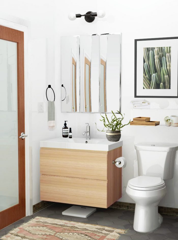
“At this point we made a few changes—the light gray tile was too much of a contrast against the darker tile “baseboard” so we switched it out and used a darker gray tile in its place. The white frame on the cactus print was also getting lost against the white walls, white shelf, and toilet so I swapped it out for a black frame to make it pop. And finally, although we both loved the neutral palette, it did need a little color…so we added a seafoam handtowel by the sink.
“The result is a fresh, modern take on her bathroom on a tiny budget. With just a few changes and the right accessories, the space looks so much more cohesive and so much more, well, Ashley!”


I love it! Next step: installation!
What do you think? Do you have a place in your home you’ve been meaning to change, but just can’t decide about?
P.S. Our home tour: Living Room, Bedrooms, and Backyard.
[All moodboards and mockups created by Anna Smith at Annabode + Co. for Hither & Thither. Anna is a regular contributor, and offers in-home services in the Denver, Colorado metro area, as well as e-design for clients across the country. Photos of our home are mine.]





















12 Comments