
I was talking to some friends about our progress moving in and how, a year later (almost to the day), we still feel like there’s a lot to finish. There’s a momentum to furnishing a place and ours has died. That’s okay—I like the idea of taking one’s time rather than rushing through the fun of decorating (to a degree) and there is the practical matter of cash flow to consider, but I do wish we could go back to that early-on momentum and borrow some of it to finish a few spaces.
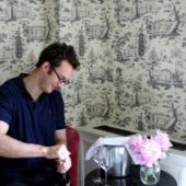
Right now, the room we keep talking around in circles is our dining room. You see part of the room the minute you walk through the door (that’s the view, above), and I love it! Because we hardly ever sit in there, the most visible bits stay pretty clean—clear of the stuff you typically set down when you walk in the door (that tends to pile, instead, in our kitchen). So I’m pretty happy with this half of the room; all of the natural light makes it bright and inviting and I’m glad our couch from New York has a place to rest. Anyway, I keep hoping to share some after photos of the whole room, but since I don’t know when that will be… let’s move onto the “before.”
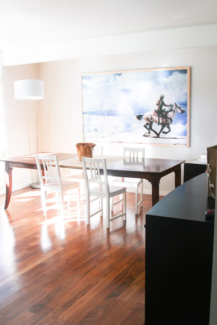
The other half is definitely a “Before.” Most of the time, it’s filled with boxes and backpacks and scooters and helmets and strollers and… a whole lot of junk. There are two empty pieces of furniture backed into the corner—because we’re not sure what to do with them. We know we want to install a light fixture that hangs over the table, but what should it look like? And then there’s the dining table. Aron made that leaf for our old one (which we found at a thrift store when we were first living in Los Angeles, ten years ago) and we usually only use it under a table cloth, but I’ve been keeping it in because (a) I don’t mind the two-tone so much and (b) we’ve learned that we like the look of a long table in here (this is roughly 100″).
Finally, the black storage isn’t really right anymore for the style of our new home; it was better suited for our apartment in New York.
But where to begin? I’ve started adding more images to a Dining Rooms pinboard.

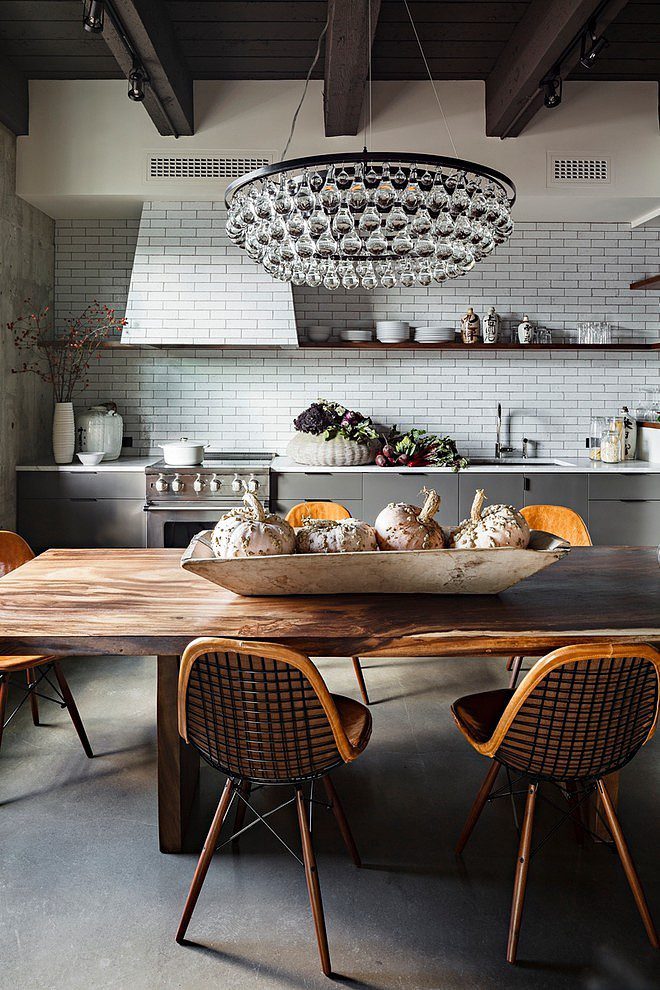
[Jessica Helgerson Interior Design]
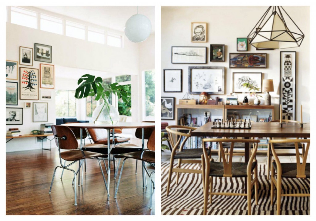
[Sources: Pretty Mommy and Design Sponge. Original sources unknown.]
I realized that I’d pinned these three images multiple times (each) over the past year or so, which must mean something, but I’m not sure I’ve found the definitive inspiration photo yet. So send it my way if you think you have one!
In the meantime, I’ve added the top table contenders to the pinboard.
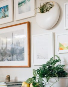
P.S. Natural wood frames, Our bedroom, Universal shelving, and the white case study planters pictured at top.
























25 Comments