By Anna Smith of Annabode + Co.
If you’re a first-time homeowner, figuring out how to decorate your home can be daunting—especially if you’ve been renting until now. For the first time, you can put holes in the walls, and paint wherever you want! You can mount your TV! You can hang actual curtains! You can even… wallpaper.
As an interior stylist, I get to see the inside of a lot of people’s houses. Many of my clients have just purchased their first home after years of apartment living and are struggling with the daunting task of filling all. that. space. And unfortunately, they usually call me after some considerable work has been done.
When we found our first home, I remember wanting it to be warm and welcoming right away. Living in an empty white box for months while we figured out what to do next was just not appealing to me. BUT I learned that if you jump in before you’re ready, not only will you end up creating more work for yourself to fix the mistakes you’ve made—you’ll waste a heck of a lot of money, too.
The good news? As long as you’re armed with a little basic info, you can start making the right choices from the beginning.
The following are my top decorating mistakes first-time homeowners make and how to avoid them…
1. Buying your furniture all at once.
This can be such a big temptation, especially if you’ve traded a smaller place for a larger one or—like us—sold most of your old things for the move. Living in a half-furnished house might not sound appealing, but choosing your furniture too quickly has its drawbacks.
For one thing, mistakes are easily made. Unless you have a really good eye it can be difficult to envision everything together beforehand. You may think those chairs will look awesome with your sofa, but you might not be able to see how they’ll work with all the other elements you’ve ordered. Returns are a hassle and can get expensive, and you definitely don’t want to fall into the trap of keeping a piece you know isn’t right just because family is coming into town or you want your new home to feel comfortable right away. You also risk blowing through your budget too quickly, splurging on pieces you could have found for less if you had simply waited.
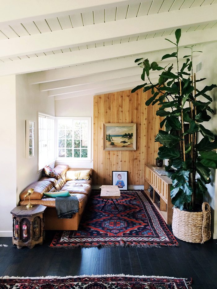
The best rooms feel collected and lived-in, as if they had evolved naturally over time. Designers create this feel with vintage pieces and collections, both of which take time to find. So: slow down and take a breath. Do your research and invest in furniture you know you’ll love one, two, five years down the road. And if you’re mother-in-law is coming to town and you’re in desperate need of a dining room table right this second, find something cheap on Craigslist that’ll do the job until you can find the perfect one.
2. Purchasing rugs that are too small for the space.
Choosing a smaller rug may seem like a smart option at first. Maybe you really love the style/color/pattern of a certain rug, but an 8 x 10 is out of your budget and the 9 x 13 sounds enormous. So you order the 5 x 7 and put it in your living room, and it seems good enough…but it doesn’t have quite the impact you were hoping for, and something about the room is still “off.”
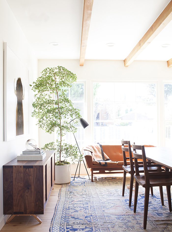
Besides paint or wallpaper, rugs have the greatest potential to transform a space because they occupy the greatest visual area. If you put a tiny rug in a large room not only does it look awkward and out of place, but no matter what you do your furniture is going to feel disconnected. Ground the room with a large rug and everything will make visual sense.
Generally, you want to find the largest rug that can fit in the space while still allowing a 12-18″ border of flooring along the edges (you don’t want it to look like carpet, after all). Another good rule is to make sure at the very least, the front feet of all your furniture can fit on the rug. For dining rooms, make sure the rug is large enough that the table and chairs are all on the rug, even when you push the chairs back to stand up. There are of course exceptions to this, and I have seen beautiful rooms with small rugs…but that doesn’t mean they couldn’t have been made better with larger ones!
3. Painting too many accent walls (or painting any at all).
Accent walls are not for everyone, and I’m actually undecided on this particular design feature. But I feel like every new homeowner I meet has ten paint colors up on three different walls and wants advice on all of them.
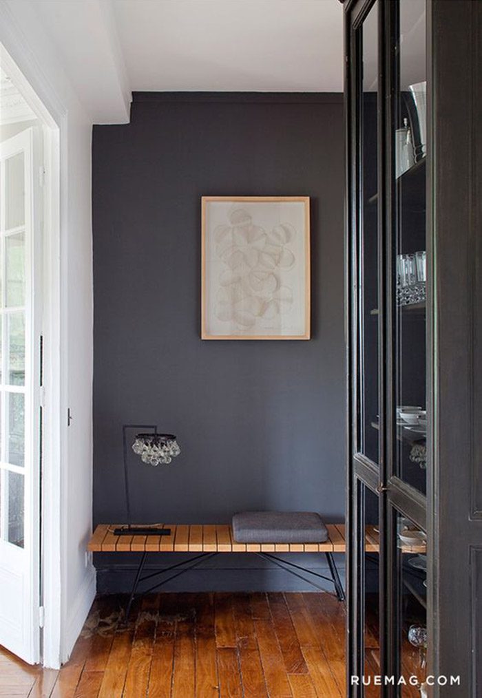
If you’re considering painting an accent wall, my advice is this: stick to one per room, and only one or two in your whole house. Too many more and they start to lose their impact.
Instead, consider adding an accent wall to highlight interesting architecture. If there is an important feature in the room (like a fireplace, or enormous windows) on another wall, it may be best to forgo one entirely. Your eye is naturally drawn to one focal point, but if there’s too much competing for its attention the effect can be too busy.
On the other hand, if you want your house to feel peaceful or more cohesive, all-over color is probably your best bet. (Good to know: neutrals are the easiest and most versatile for main living spaces.)
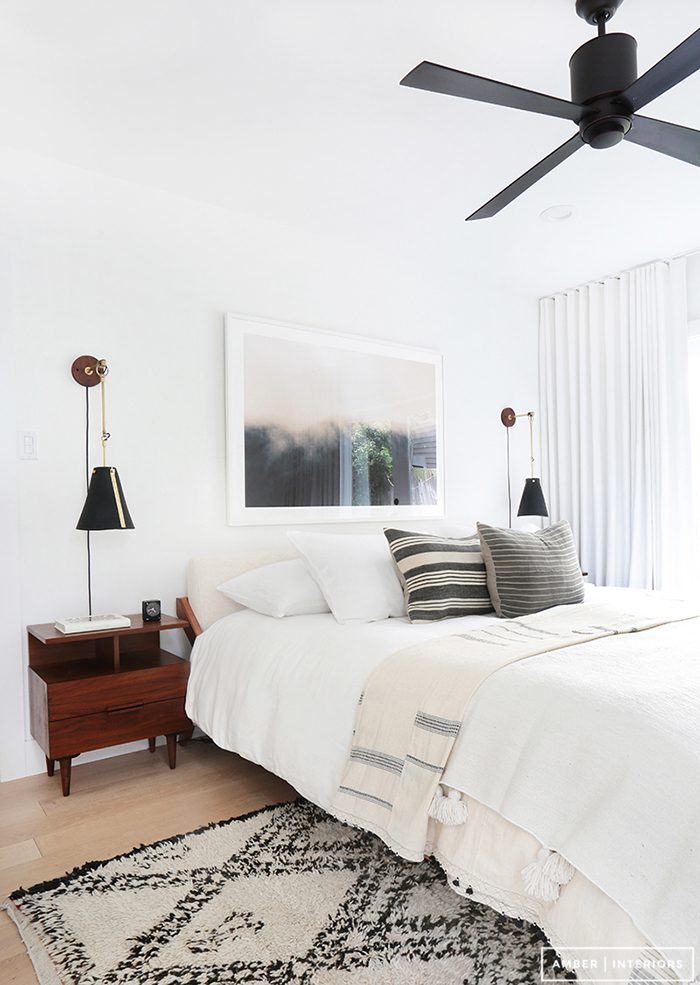
4. Hanging curtains too low.
Most people hang curtains right above their window or doorway trim, but you’ll actually make your ceilings appear taller (and your room larger) if you hang them higher. I recommend keeping a distance of 1-3″ between the top of the curtain (not the rod, unless you have pole-pocket or tab curtains) and the ceiling. If you have crown molding, follow the same rule but consider the base of the molding as your ceiling height.
In addition, make sure your curtains aren’t covering any part of the window while open. Rods should extend 6-12″ on either side of the window to allow for this, depending on how much fabric there is to accommodate. This will make the room brighter (you won’t be losing any light by covering the glass with fabric) and make the window look larger, too. Win, win!
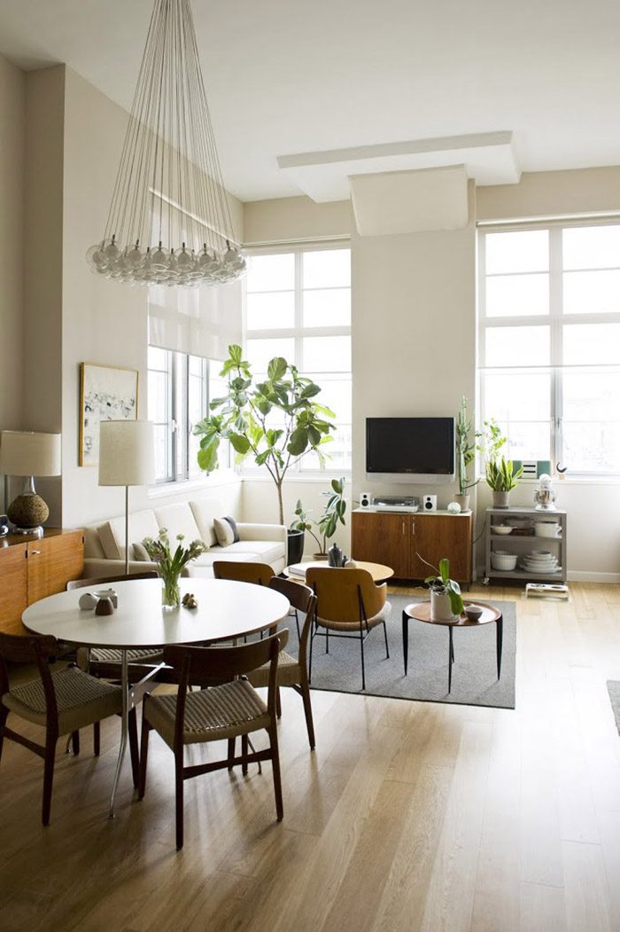
5. Matching your furniture or your wood.
This one goes back to the “collected over time” point from mistake #1. Matching your furniture is a big don’t. Of course, for decades this was de rigueur—but that’s exactly why you shouldn’t do it now. (Doing so will make your home feel dated.) That’s not to say you can’t buy matching armchairs or pillows, just that you should steer clear of matching said armchairs to your sofa, or your dresser to your bed, etc. if you want your spaces to feel modern and fresh.
Wood tones can be a bit tricky, but I personally like to mix it up. Too much of one wood tone in a space can get a bit boring, but not all woods go together. If you have a lot of color or pattern in a room, one or two woods are probably best so as not to compete or distract from the rest of the space. On the other hand, if your rooms are more neutral or subdued than using a range of woods can add texture and warmth.
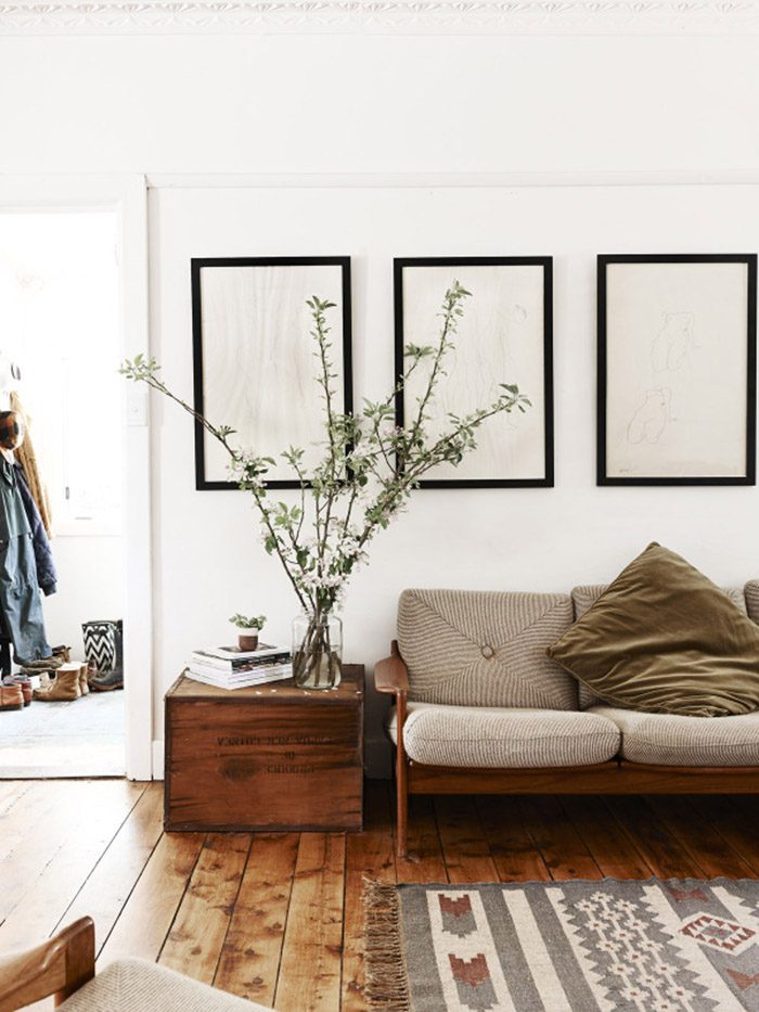
6. Ignoring scale.
Scale is not the first thing people usually think of when decorating a room, but it plays an important role in creating harmony and balance. Furniture, especially vintage or antique furniture, is always created with scale in mind. The low-slung seats and low-profiles of mid-century furniture fit perfectly with ranch homes of the 50s and 60s when ceilings were decidedly lower, but can look out of place in a room with more height. And a large, overstuffed couch is going to feel claustrophobic in your small apartment.
Luckily, scale is an easy concept to grasp. If you have a small space, choose small furniture. Conversely, large, chunky furniture looks best in large, open spaces. And if you love mid-century furniture and have cathedral ceilings, don’t despair! Add height in other ways like plants, artwork, or window treatments.
Not only does furniture need to relate in scale to its environment, it also has to relate to each other. Try keeping the arms of your living room furniture around the same height. Side tables should be a few inches lower than the arm height of adjacent furniture — too low and you’ll be reaching too much, too high and it will upstage the seating.
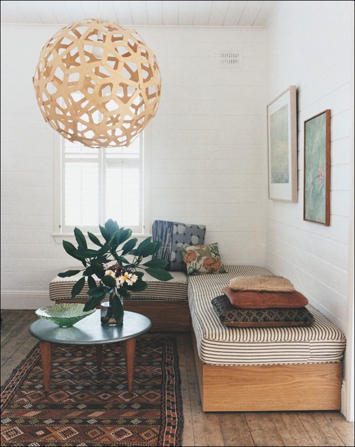
7. Filling your walls.
I always hear people who have just moved say in despair, “we still don’t have anything up on our walls!” Somehow, it doesn’t feel like home until we’ve made that kind of semi-permanent mark. And yes, hanging artwork, mirrors, and shelves can go a long way in making a room feel “finished,” but it’s important to know where to hang those things.
It’s tempting to think every wall needs something on it, but that’s usually not the case. Just like in a work of art, your eye needs visual resting places as it travels throughout a room. If there’s too much to take in, too many walls competing for attention, whatever you do place on them won’t have a chance to shine.
Again, remember to think about the focal point of the room. By hanging that gallery wall behind your armchairs, are you leading the eye to your dramatic fireplace on the next wall, or are you detracting from it? Does that little patch of wall between those two doorways need something to add height above a piece of furniture, or would the room be better without it? Try a little experimenting…when it comes to your walls, sometimes less is more.
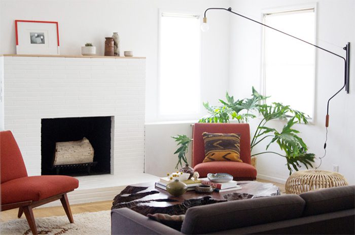
8. Painting small rooms in dark colors.
Another simple rule that is easy to forget? Painting a small room in a dark color will always make it feel smaller.
This isn’t necessarily a bad thing—if you wan’t a space to feel cozier, a darker shade will certainly do the trick. Dark colors are also great for small spaces like guest baths or closets because you can experiment with drama or color without too much of a commitment. But if you’re considering what shade to paint your living room and you like bright and airy spaces…go lighter. (If you really want a space to feel larger, go white!)
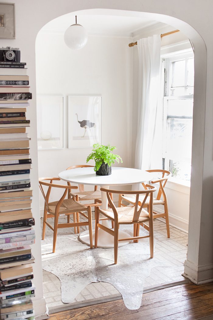
9. Hanging artwork too high.
Even if you’ve nailed everything else, your room will feel awkward if your mirrors or artwork aren’t hung at the right level. If they’re too high, they’ll throw off the scale of the room and look like they’re floating in space. Bring them down to the right level— centered at eye level is ideal, around 54-57″ from the floor.
I tend to the lower end of that (especially if I’m using mid-century furniture) but it really depends on the room. And if what you’re hanging is above a piece of furniture, you may need to go even lower to prevent too large of a gap between the two.
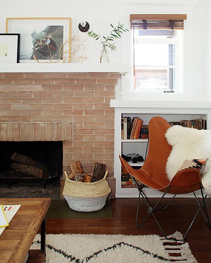
10. Decorating contrary to the architectural style of your house.
I’m afraid I might break a few hearts with this one, or at least ruffle a few feathers, but here goes…No matter what your personal tastes, you should always keep in mind the period and style of your house.
I know, it’s hard—especially if where you live now isn’t exactly your dream home. But there’s nothing more jarring than walking into a mid-90s model home and finding yourself in the French countryside. It doesn’t feel natural, and it just doesn’t work.
This is NOT to say you can’t decorate in your style—on the contrary, doing so is obviously going to make you love your home so much more! But scale it back accordingly. If you don’t live in a 1950s home, don’t go 100% retro—mix in other styles you like, with at least one from the same time period as your house.
For instance, my own personal style actually leans more towards the rustic. If I had my way we’d be living on a farm in Vermont, milking happy grass-fed cows and canning vegetables from our organic, non-GMO garden (a girl can dream!). Alas, we don’t…and there’s no way that kind of vibe would fly in our current 1970s suburban home. Instead, I mix rustic touches with pieces from the 60s and 70s, more modern elements, and others that are vintage-inspired.
The one exception to this is if you live in an a very old home (think 100+ years) that retains its original architectural details, and your furniture is entirely modern. Very old + very new almost always works well together.
All this being said, there are never any hard-and-fast rules when it comes to decorating your home. The most important thing is always that you love your space and feel comfortable in it! And if you’ve done any of the above, don’t feel bad—I’ve made every single one of these mistakes too…just look back through my blog!
Sources (all examples of getting it right): 1 // 2 // 3 // 4 // 5 // 6 // 7 // 8 // 9 // 10
Anna Smith wants to live in a world where good design is accessible and affordable for everyone. An interior stylist and e-designer based in Denver, Colorado, she creates modern homes for clients across the country through her firm Annabode + Co. When not buried in swatches and throw pillows, you can find her elbow-deep in renovations at her own fixer-upper. Work with Anna.
P.S. More home & design guest posts by Anna.








20 Comments